> open ~/case-studies/iclass
iClass · 2025
Modernizing the software that runs the studio floor
How we modernized the UI, design system, and core flows of a class-management platform — and built a composable filter system that finally works on a tablet.
- Client
- iClass
- Industry
- Class Management, SaaS
- Stage
- Established · 100M+ registrations since 2008
- Duration
- 8 weeks (2 design)
- Services
- UX Audit
- Design System
- UX Flows
- UI Modernization
- Responsive Design
iClass is class-management software for gymnastics, dance, swim, and cheer studios — scheduling, enrollment, attendance, billing, the lot. Coaches and front-desk staff run the whole day on it, mostly from a tablet or phone on the floor. The product was deep and trusted, but the UI had aged, every screen was built its own way, and the flows that mattered most — like filtering a packed schedule — buckled on a small screen. We modernized it in eight weeks, two of them design.
- 8 weeks
- Audit to front-end
- 2 weeks
- Design sprint
- Composable
- New filter system
- Tablet-first
- Rebuilt for the floor
the situation
A deep, trusted product showing its age
iClass has run on the same foundations since 2008 and has processed over 100 million registrations. That track record is the asset — studios trust it with their schedules, their rosters, and their billing. But the interface had aged in place: dense desktop-era screens, inconsistent patterns, and visual debt that made a capable product feel older than it was.
There was no design system underneath it. Every screen had been built its own way, so buttons, spacing, and color drifted from page to page, and any modernization meant touching each surface by hand. Shipping a consistent change across the product was slow and risky.
The hardest part lived in the flows. Staff slice their data constantly — by program, instructor, day, level, age, status — but the filters were rigid and didn't combine. And nearly all of this happens on a tablet or phone at the front desk or on the floor, not at a desk, where the old layouts fell apart.
A UI from a previous era
Dense, dated screens and inconsistent patterns made a powerful product feel old. The look no longer matched the trust studios placed in it.
No design system to scale
Every screen was built its own way. With no tokens or shared components, modernizing meant reworking each surface by hand — slow, and easy to break.
Filters that wouldn't compose
Staff needed to slice schedules and rosters by many dimensions at once. The existing filters were rigid and single-purpose, so the most frequent task was the most painful one.
Desktop software, used on the floor
The customer base is coaches and front-desk staff working from tablets and phones — but the layouts were built for a desktop. The real context of use was the one the UI ignored.
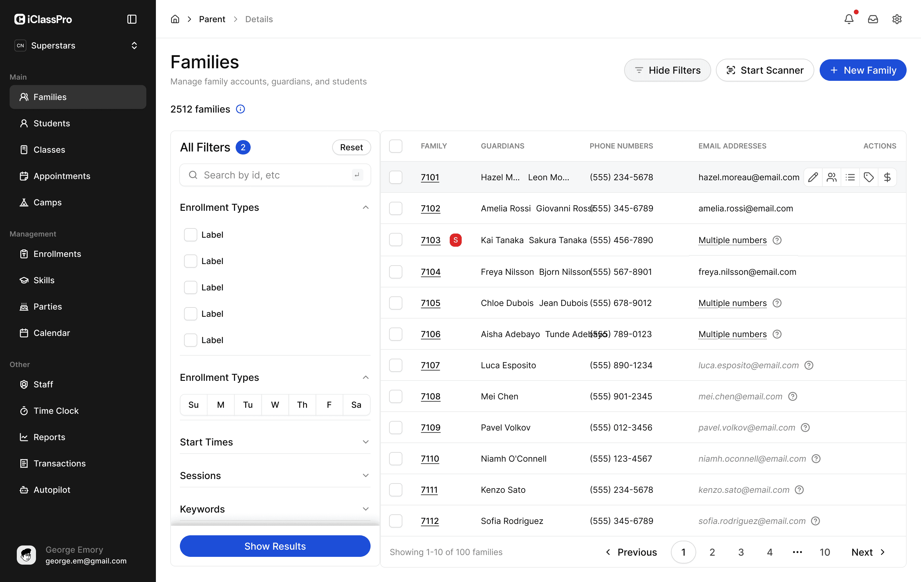
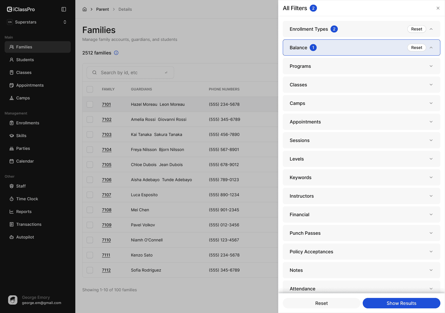
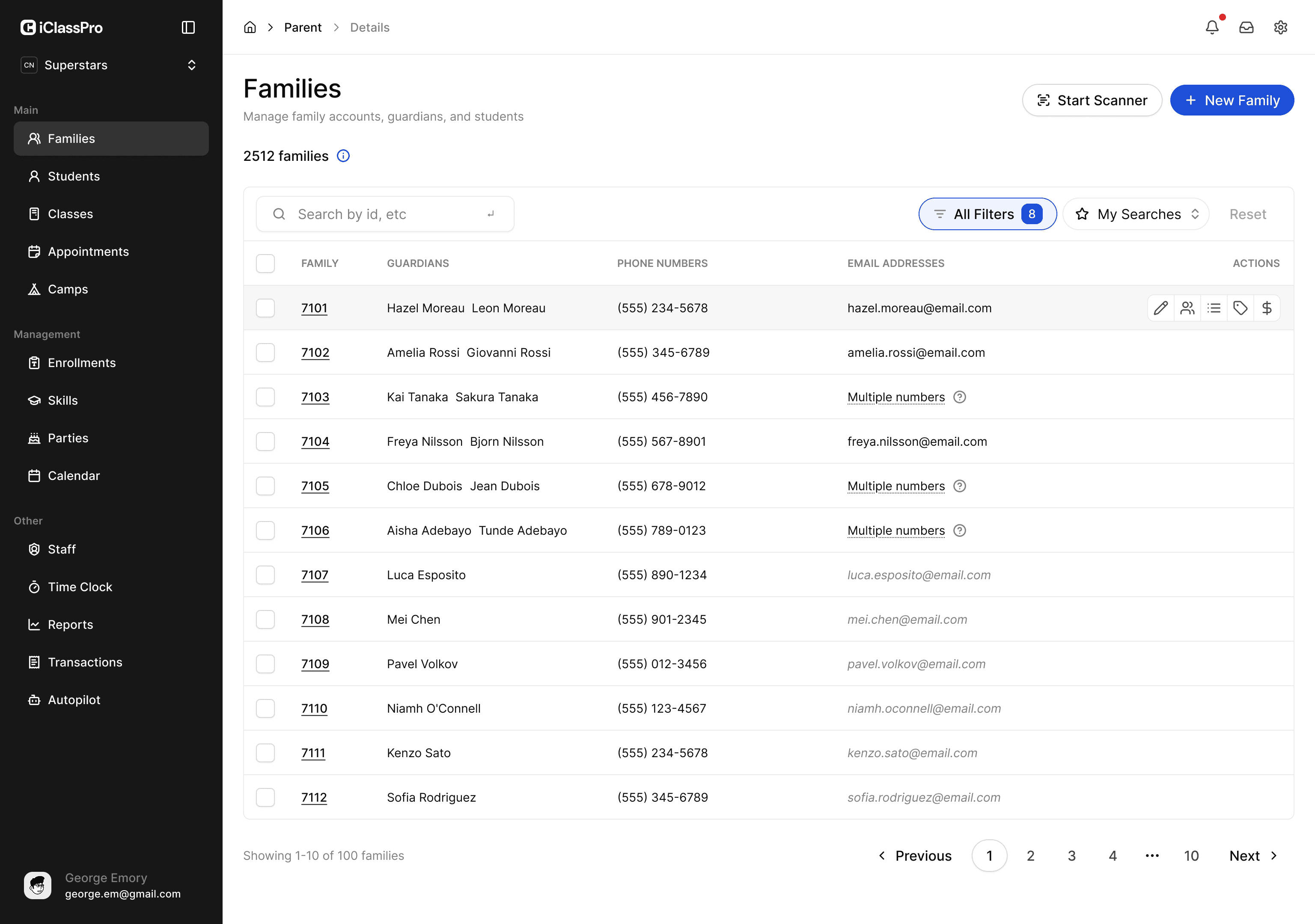
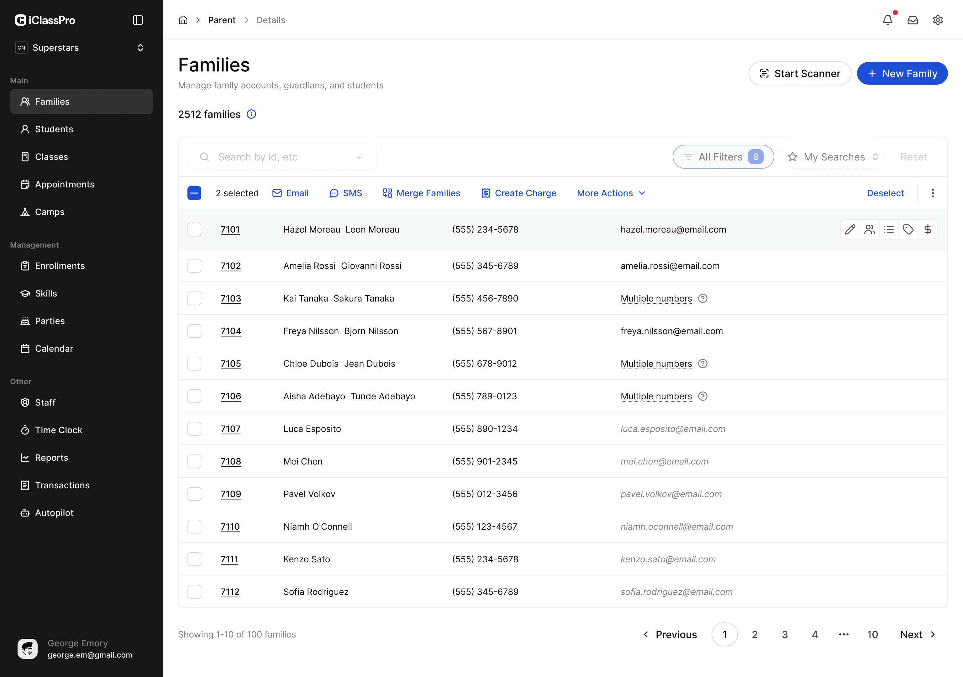
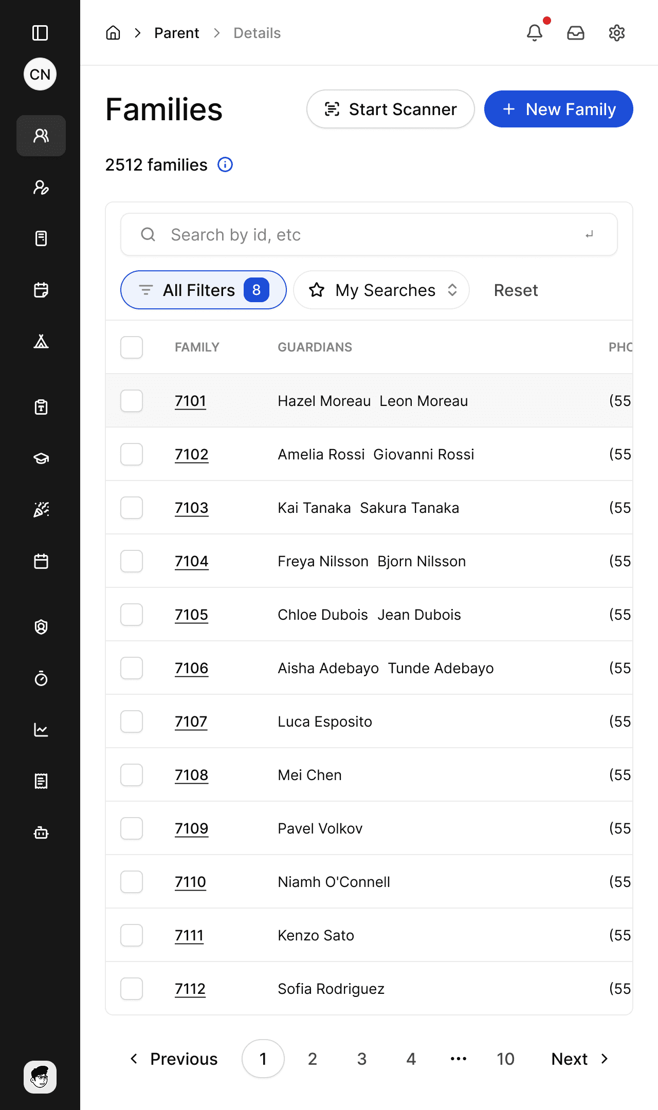
fig.01 — Composable filters — conditions that stack and combine, inline beside the data.
> tree the approach
- 01
audit, then a two-week design sprint
We mapped the highest-traffic flows and where they broke on small screens, then compressed the design into a focused two-week sprint — modern UI direction, key flows, and the filter model, decided fast so the build had six clear weeks to run.
- 02
a design system to modernize at scale
Tokens, type, spacing, and a variant-complete component library in Figma and in code. One source of truth so the modernization landed consistently across screens instead of one-off page by page.
- 03
make the filters composable
The core challenge. We designed filters as composable units that stack and combine — program plus instructor plus day plus status — with a model that reads cleanly and stays usable as conditions add up, not a wall of dropdowns.
- 04
design for the tablet first
We designed the dense, data-heavy screens for touch and small viewports first, then scaled up — so the experience is strongest exactly where staff actually use it, on the floor, not as a desktop layout squeezed down.
- 05
ship modernized flows in their stack
The system and flows were built as production front-end in their stack, so the modernization was running code the team could extend — not a spec to reinterpret screen by screen.
“The product finally looks as good as it works — and our staff can actually run a busy day from a tablet now. The filters alone changed how the front desk works.”
the outcome
A modern product that still feels like itself
In eight weeks iClass went from dated desktop screens to a modern, consistent UI backed by a real design system — without losing the depth studios depend on. The two-week design sprint set the direction; the system made it land across the product instead of one screen at a time.
The filters became composable: staff stack conditions to get to exactly the schedule or roster they need, on the device in their hand. Designed tablet-first, the data-heavy flows finally work where the work happens — on the floor — and the team has a system to keep modernizing on.
- 1 system
- Tokens + components, Figma & code
- Composable
- Filters that stack and combine
- Tablet + mobile
- First-class, not squeezed down
- 8 weeks
- Audit to shipped front-end